
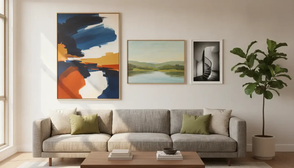
Wall art is often treated as the final purchase in a decorating project. Furniture arrives first, followed by rugs, lighting, curtains, and smaller accessories. Only then does attention turn to the empty walls, which can lead homeowners to select artwork based on convenience rather than purpose. That sequence overlooks the influence art can have on the color, scale, and emotional tone of a room. A strong piece can connect otherwise separate furnishings, direct attention toward an architectural feature, or provide contrast in a carefully restrained interior. The best results come when wall art is viewed as part of the room’s structure rather than as a decorative afterthought.
The choice becomes more complicated because nearly every major art style is now readily available for residential spaces. Abstract prints compete with landscapes, portraits, photography, botanical studies, vintage posters, text-based designs, and architectural illustrations. Each option changes the way a room is experienced. A panoramic photograph can create a sense of distance, while an energetic abstraction can bring movement to a quiet wall. A classical portrait may introduce history and formality, whereas a simple line drawing can make the same room feel lighter and more current. Choosing successfully requires more than identifying an image that looks attractive on its own.
Homeowners should begin by asking what the room needs from the artwork. Some spaces need a focal point that commands attention from the moment a person enters. Others benefit from quieter work that supports furniture, materials, and natural light without competing with them. The artwork may need to make a compact room feel more open, soften severe architecture, or give a neutral palette greater depth. Personal meaning also matters because art is among the most expressive objects in a home. A thoughtful decision balances emotional response with practical considerations such as size, placement, color, and material.
Understanding What Abstract Prints Bring to an Interior
Abstract art creates meaning without relying on a clearly recognizable subject. Instead of depicting a person, landscape, or object, it uses color, shape, line, texture, rhythm, and contrast to produce a response. This quality gives abstract prints considerable flexibility in residential interiors. Viewers are not required to understand a particular story before engaging with the work. One person may see movement in a composition, while another may respond to its calm palette or structural balance. Because the interpretation remains open, an abstract image can continue to feel interesting after years of repeated viewing.
The category itself is far broader than many shoppers initially expect. Some abstract works feature loose brushwork, layered color, and visible gestures that create a sense of spontaneity. Others are built from controlled grids, geometric forms, repeated lines, or carefully balanced areas of negative space. Soft tonal abstractions can reduce visual tension in a bedroom, while saturated compositions can give a dining room greater energy. Minimal works may provide relief in a room filled with patterns and objects, while complex pieces can prevent a restrained interior from feeling impersonal. Recognizing these differences is important before comparing abstract art with other wall art styles.
Once homeowners understand the visual effect they want, the next challenge is finding a broad enough selection to compare artists, materials, formats, and sizes. Online art marketplaces can help at this stage by allowing buyers to refine their preferences before committing to a specific piece. One such marketplace, Chicago-based iCanvas, offers ready-to-hang artwork from independent artists, licensed estates, and cultural institutions around the world. Its catalog includes wall art produced on canvas, fine art paper, acrylic glass, wood, and metal, helping homeowners compare how different presentation methods affect an image. If you are drawn to nonrepresentational work, you can explore the brand’s selection of abstract canvas prints, spanning varied colors, compositions, and moods. This browsing process works best as visual research, since the final choice must suit the room’s proportions, lighting, and character.
Comparing Abstract Art With Representational Work
Representational art gives the viewer an immediate point of recognition. Landscapes, portraits, city scenes, wildlife images, and still lifes communicate through subjects that can be identified without explanation. That familiarity often makes a room feel accessible and personal. A photograph of a favorite city may reflect a meaningful period in someone’s life, while a coastal landscape can reinforce a household’s connection to travel or nature. The subject becomes part of the room’s story and may prompt conversation among guests. This direct narrative quality is one of the strongest reasons to choose representational work.
The same specificity can also limit how easily the artwork adapts to changes in the room. A dramatic tropical image may strongly influence the colors, fabrics, and accessories placed around it. A large portrait can establish a formal atmosphere that is difficult to soften with casual furnishings. Abstract art is often more adaptable because it can relate to a space through color, movement, and proportion rather than through subject matter. A composition can echo the curve of a chair, repeat the angles of shelving, or add visual tension to a symmetrical furniture arrangement. It participates in the room’s design without necessarily dictating a theme.
The decision is therefore not a simple contest between traditional and modern taste. Abstract work can sit comfortably in an older home when its scale and palette respond to the architecture. Representational paintings can give a contemporary interior greater warmth and historical depth. The more useful distinction concerns the type of experience the homeowner wants to create. Those seeking memory, narrative, or a clear cultural reference may prefer recognizable imagery. Those seeking atmosphere, visual movement, or interpretive freedom may find abstraction more effective.
Weighing Photography, Graphic Art, and Typography
Photography occupies an interesting position between abstraction and representation. It records real subjects, but the photographer’s decisions about framing, exposure, focus, timing, and perspective can radically alter how those subjects appear. An architectural photograph may emphasize repeating windows until the building reads almost like a geometric pattern. A close view of water, stone, or shadow can feel abstract even though the source remains recognizable. Black-and-white photography is particularly useful when a room needs structure without additional color. It can introduce drama, clarity, and detail while remaining compatible with a wide range of furnishings.
Graphic art and illustration offer another middle ground. These works may depict people, plants, buildings, or everyday objects, but they often simplify those subjects into stylized forms. Vintage travel posters, for example, use recognizable destinations while relying on bold shapes and limited palettes. Contemporary illustration can bring humor, cultural references, or personality to a room without the weight of a formal painting. Graphic pieces work especially well in studies, kitchens, children’s rooms, music spaces, and informal sitting areas. Buyers should still consider whether the imagery feels personally relevant or merely reflects a passing decorating trend.
Typography communicates even more directly because viewers instinctively read the message before assessing the composition. A phrase, quotation, or single word can establish humor, encouragement, nostalgia, or identity. This can be effective in a home office, entryway, or casual family space where direct communication suits the room’s purpose. It can also become visually tiring when the wording is overly familiar or sentimental. The strongest text-based pieces treat letters as design elements rather than relying only on the message. Scale, spacing, typeface, and contrast should be evaluated with the same care given to any other form of art.
Matching the Art to Color, Architecture, and Furniture
Color is often the first consideration when homeowners compare art with an existing room. The common instinct is to search for a print that repeats the exact colors found in the sofa, rug, or curtains. That approach can create coordination, but it may also make the room look overly calculated. A more sophisticated method is to examine undertones, intensity, and temperature rather than exact matches. A print containing rust, ochre, and deep blue might work in a neutral room because it adds warmth and contrast. The artwork should belong in the space without appearing to have been selected from a fabric swatch.
Architecture establishes another set of requirements. Tall walls may support vertically oriented works or stacked arrangements that emphasize ceiling height. Long walls above sofas, sideboards, or beds often benefit from horizontal compositions or groups that occupy enough width. Decorative molding can frame artwork naturally, but it can also make an undersized piece appear insignificant. Minimal interiors depend heavily on negative space, meaning the distance around the artwork becomes part of the presentation. Older homes may require more precise planning because fireplaces, built-in shelves, doors, and uneven wall sections divide the available surface.
Furniture should be considered as part of the same composition rather than as a separate layer. Artwork above a sofa usually needs enough width to feel visually connected to the seating area. A small print placed too high can appear detached, even when the image itself is attractive. Curved furniture may pair well with fluid forms, though a geometric work can create a productive contrast. Rectilinear pieces can reinforce the structure of modern cabinetry or soften it through organic imagery. The strongest arrangements balance the artwork’s visual weight with the size, silhouette, and placement of the furniture below it.
Selecting the Right Material and Presentation
The material on which an image is printed can significantly change its appearance. Canvas has a textured surface that gives reproductions a tactile and painterly character. It usually appears softer and less reflective than work displayed behind glass. These qualities make canvas particularly effective for expressive abstract images, landscapes, and compositions with visible brushwork. Fine art paper offers sharper detail and often produces a more traditional presentation when combined with a frame and mat. It can be a strong choice for photography, illustration, line work, and images that depend on precise edges.
Acrylic glass, metal, and wood provide more specialized effects. Acrylic surfaces can give colors additional saturation and make dark areas appear deeper, though they may also reflect windows and nearby lighting. Metal prints often create a clean, contemporary appearance and can suit high-contrast photography or graphic compositions. Wood introduces natural grain, warmth, and variation, which may soften modern imagery or complement rustic materials already present in the room. Each format affects brightness, texture, and perceived formality. The material should strengthen the artwork rather than simply signal a higher price or a more fashionable finish.
Framing defines the boundary between the image and the surrounding wall. A narrow black frame can sharpen a pale composition, while light wood may connect the piece to flooring, cabinetry, or furniture. Wide mats give smaller works breathing room and can make them appear more deliberate. Frameless canvas offers immediacy but may not provide enough architectural definition in a formal room. A gallery wall can mix frame styles successfully when another element, such as color, spacing, or subject matter, creates order. Complete uniformity is not required, but visible inconsistency should look intentional.
Balancing Personal Taste With Long-Term Appeal
Art should not be purchased only because it matches the room in its present form. Furniture is replaced, walls are repainted, and households move from one home to another. A piece with genuine personal appeal can often adapt to several settings over its lifetime. An abstract print may move from a living room to a bedroom or office because its meaning is not tied to one function. A representational work can be equally adaptable when its subject carries lasting emotional significance. The ability to remain relevant is usually more valuable than perfect coordination with a temporary color scheme.
Decorating trends can still help homeowners identify new artists, formats, and visual approaches. Neutral abstractions, minimalist line drawings, retro posters, and oversized botanical images have all experienced periods of strong popularity. The risk is that repeated exposure can make a once-distinctive style feel generic. Buyers should ask whether they are responding to the artwork itself or to its familiarity from staged interiors and social media. Saving an image and revisiting it after several days can help separate durable interest from immediate enthusiasm. Continued curiosity is a stronger buying signal than instant recognition.
Personal taste also does not require every room to follow the same artistic formula. A homeowner may prefer quiet photography in bedrooms, expressive abstraction in living areas, and playful illustration in informal spaces. The collection can still feel coherent through repeated frame materials, related color temperatures, or consistent attention to scale. Homes often become more interesting when the art reflects different periods, places, and experiences. A carefully assembled mix feels more personal than a group of pieces purchased to match one seasonal trend. The objective is continuity of sensibility, not strict uniformity.
Using Budget and Scale More Effectively
Budget influences more than the number of works a homeowner can purchase. It affects dimensions, materials, framing, reproduction quality, and whether a piece is part of an open or limited edition. One large, well-produced print may create more impact than several small pieces selected mainly to cover empty walls. A collection of modest works can also succeed when the arrangement has a clear visual logic. Spending should follow the needs of the wall and the importance of the location. Empty space is not a failure when it allows stronger pieces to command attention.
Scale is one of the most common sources of disappointment when purchasing wall art online. Product images are frequently shown in digitally arranged rooms, where the artwork may appear larger than its actual dimensions. Buyers should confirm measurements rather than relying on the staged image. Removable tape or paper templates can be used to mark the proposed size directly on the wall. This reveals whether the piece relates properly to nearby furniture and architectural elements. It also helps determine whether one large work or a coordinated grouping would be more effective.
A collection does not need to be completed in a single shopping session. Beginning with one substantial piece gives the room an anchor and establishes a direction for later additions. Smaller works can then be selected through shared colors, themes, techniques, or emotional qualities. Abstract prints can sit beside photography, drawings, or vintage graphics when the relationships are clear. Mirrors, textiles, ceramics, and framed personal objects may also become part of the wall composition. A gradual approach allows the collection to reflect experience rather than retail convenience.
Building a Practical Decision-Making Process
The final choice should begin with the function of the room and the feeling it needs to create. A living room may require a piece that remains engaging from several viewpoints. A bedroom may benefit from quieter imagery and lower contrast. A dining room can support greater drama because it is experienced during focused periods rather than throughout the day. Hallways and staircases are well suited to sequences, series, and gallery-style arrangements. Workspaces usually need enough visual interest to encourage energy without becoming distracting.
The next step is to compare possible pieces under realistic conditions. Images should be viewed on more than one device because color and brightness vary across screens. Detailed photographs can reveal surface texture, edge treatment, and print quality. Measurements should be checked against the wall, furniture, and likely viewing distance. Natural and artificial light must also be considered, especially for dark images and reflective materials. A work that appears balanced in daylight may be obscured by glare or shadow in the evening.
Choosing between abstract prints and other wall art styles is ultimately a matter of purpose rather than hierarchy. Abstract work offers atmosphere, flexibility, and freedom of interpretation. Landscapes, portraits, and photography offer recognition, narrative, and personal association. Graphic art, illustration, and typography provide additional ways to combine visual style with specific meaning. Practical considerations such as scale, material, lighting, and budget can prevent costly mistakes. The best choice is the one that supports the room while revealing something authentic about the people who live there.