Thanksgiving is all about warmth, gratitude, and bringing loved ones together.
But have you ever stopped to think about the colors that make this holiday feel so special? The rich oranges, deep reds, golden yellows, and earthy browns are not just pretty.
They set the mood for the entire celebration. Choosing the right Thanksgiving colors can turn your home into a cozy, festive space that everyone will remember.
In this guide, you will learn what Thanksgiving colors are, where they come from, and how to use both classic and modern palettes in your decor.
Let’s make your Thanksgiving as beautiful as it is meaningful.
What Are Thanksgiving Colors?
When people ask what Thanksgiving colors are, they usually think of the warm palette tied to fall. These include rich oranges, deep browns, golden yellows, and bold reds.
The colors come straight from nature and the harvest season. They represent abundance, gratitude, and family gatherings. Thanksgiving colors are not picked at random.
They carry history, meaning, and cultural roots that make them meaningful.
History of Traditional Thanksgiving Colors
Understanding where these colors come from helps you appreciate why they feel so right for the holiday.
- Inspired by the harvest: Early feasts included pumpkins, corn, cranberries, and squash, which formed the color palette still used today.
- Native American influence: Earth tones came from clay, berries, stone, and dried plants found in nature.
- Colonial celebrations: Simple, natural tones from the land filled colonial homes and reinforced rustic color choices.
- Victorian influence on fall décor: Later centuries added romance to the holiday with rich oranges, deep reds, and shiny golds.
- Modern expansion: Today’s palette now includes trendy shades like navy, sage green, terracotta, and metallic finishes.
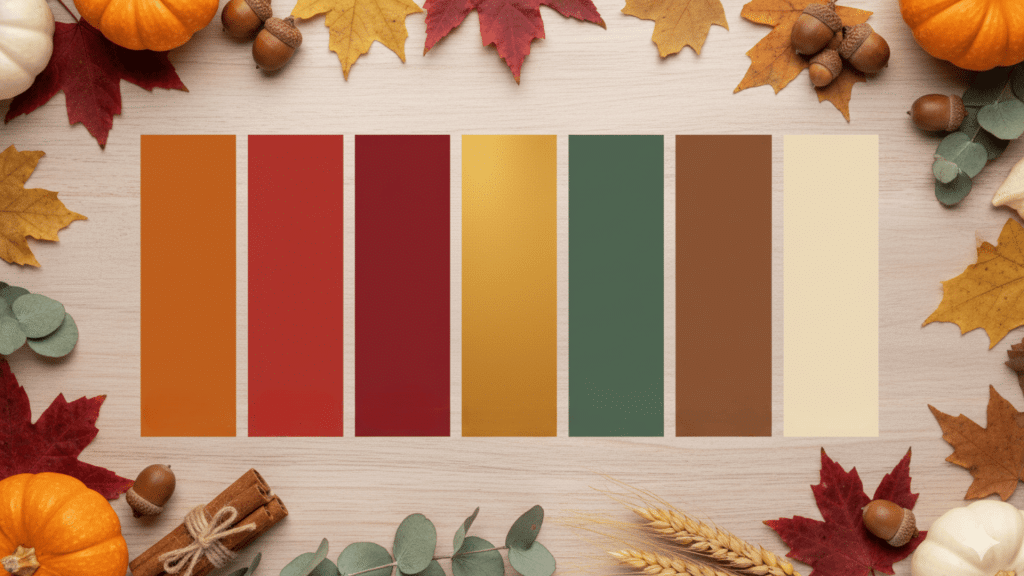
Traditional Thanksgiving Color Palette
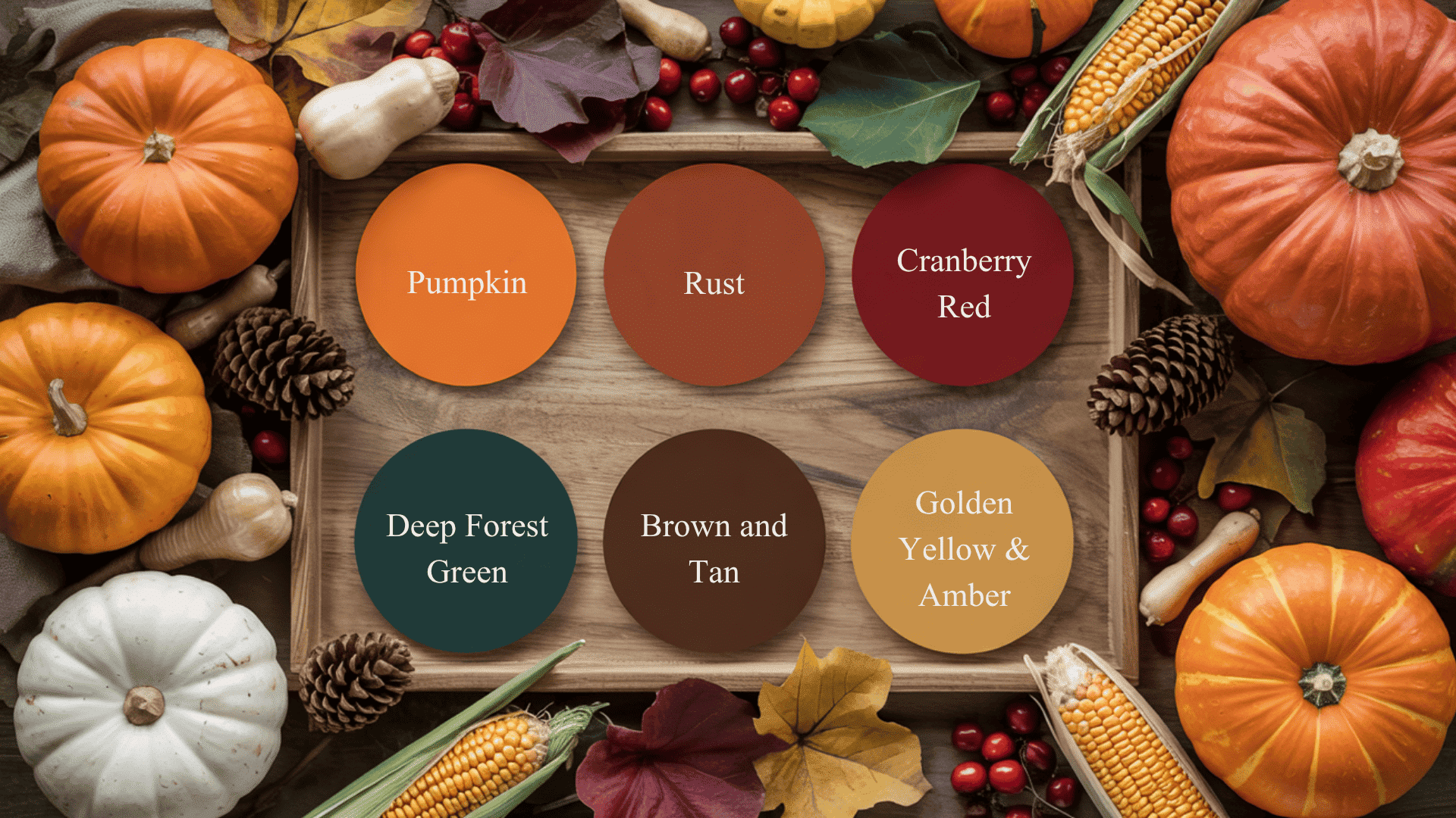
The core palette that homes still use today brings warmth and seasonal beauty to any space. Here are the classic shades that define traditional Thanksgiving decor.
| Color | Shade Description | What It Represents |
|---|---|---|
| Pumpkin Orange | Bright, warm orange | Harvest, energy, fall festivities |
| Rust | Deep burnt orange | Comfort, rustic charm, nature |
| Cranberry Red | Rich, bold red | Abundance, celebration, gratitude |
| Deep Forest Green | Dark, earthy green | Growth, balance, natural beauty |
| Brown and Tan | Warm neutral tones | Grounding, simplicity, earth |
| Golden Yellow & Amber | Soft to rich yellows | Warmth, light, autumn glow |
These tones symbolize warmth, comfort, and autumn’s natural beauty. They work together to create a cozy and inviting holiday atmosphere.
Classic Thanksgiving Color Palettes
These timeless color combinations have been used for generations and continue to create beautiful, welcoming spaces every Thanksgiving.
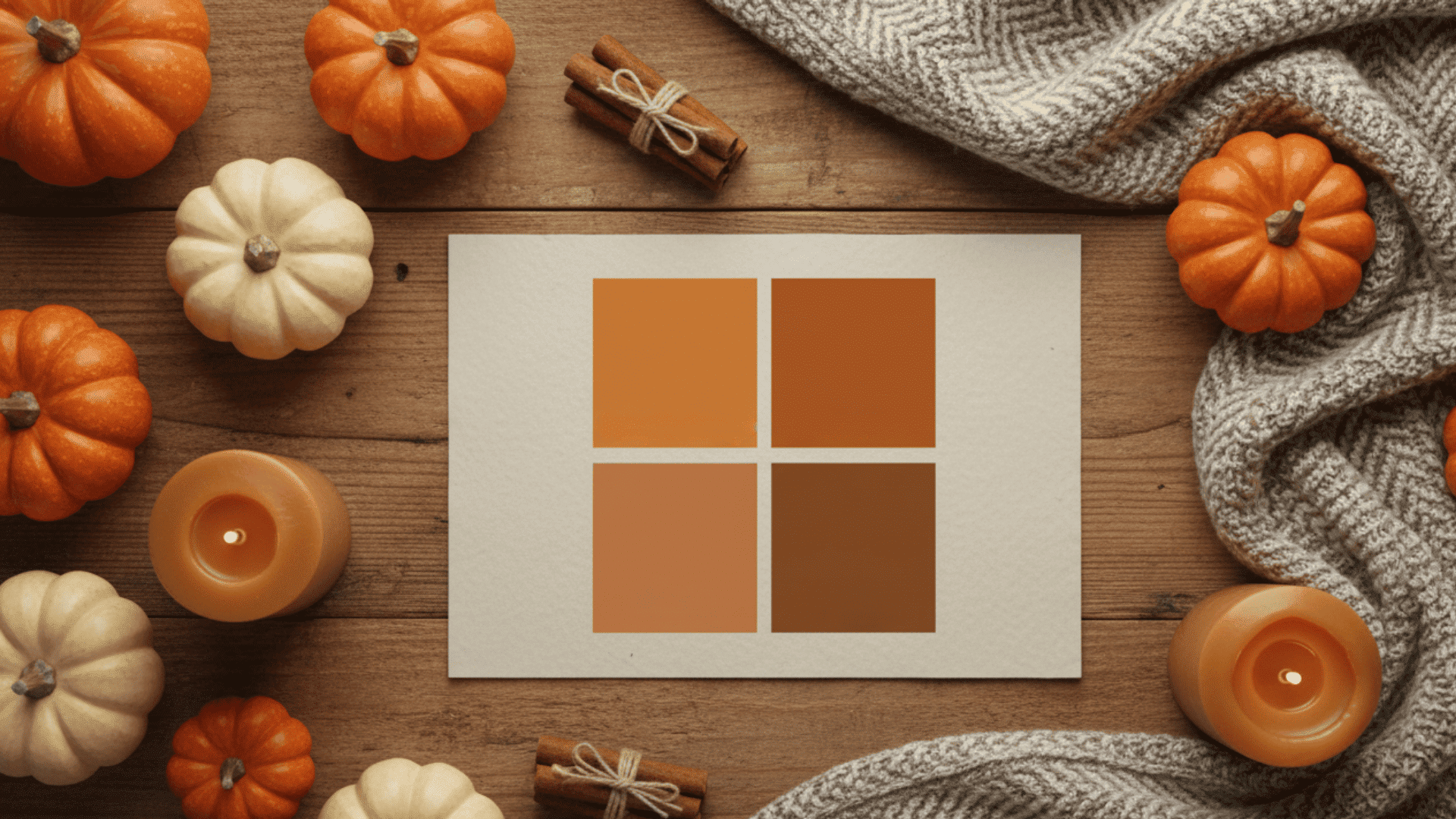
1. Warm Earth Tones
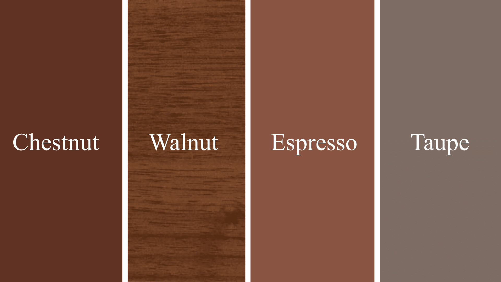
Shades: Chestnut, walnut, espresso, taupe
These colors create a grounded, rustic feel. They work perfectly for natural, wood-heavy interiors.
Earth tones bring a sense of calm and stability to your space. Use them in living rooms, entryways, or dining areas for a cozy atmosphere.
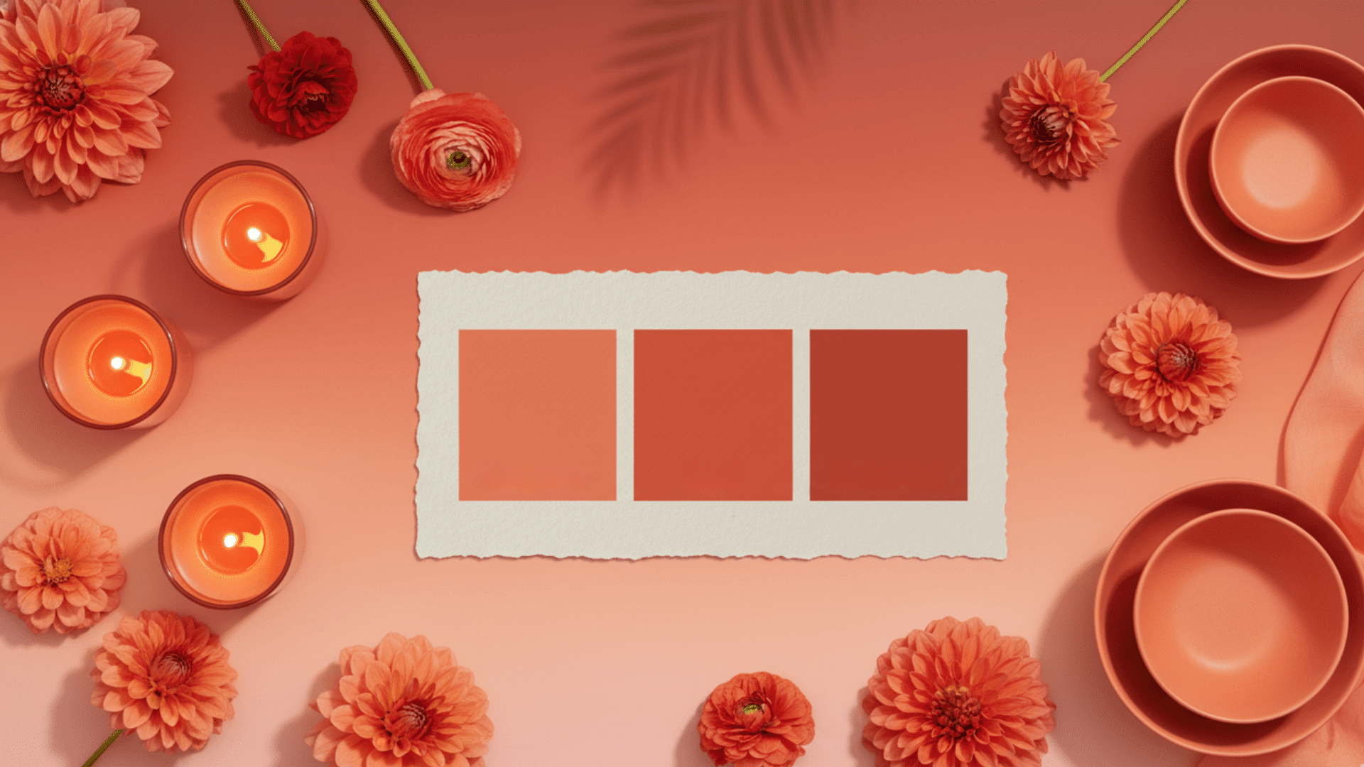
2. Autumn Reds & Oranges
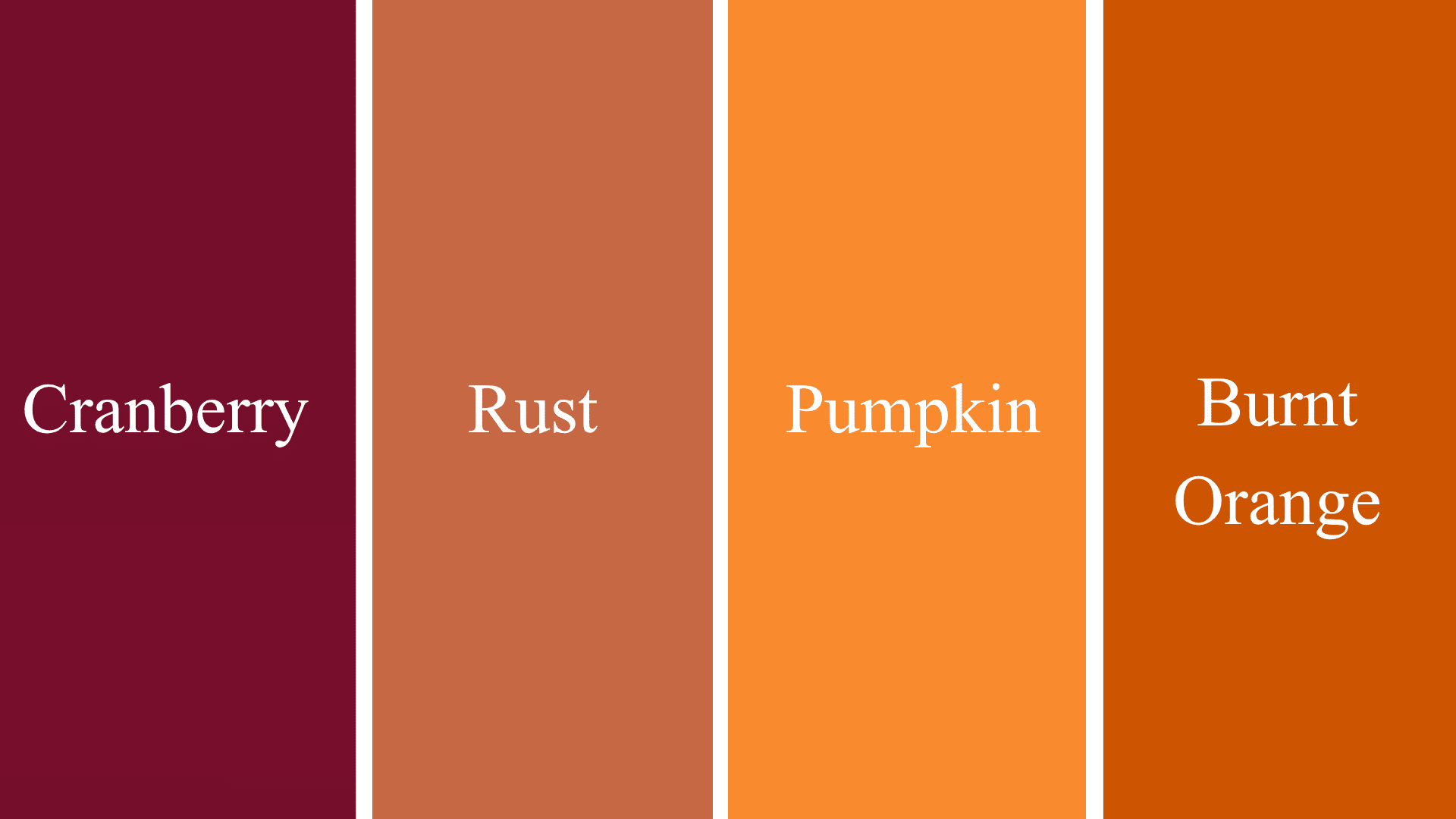
Shades: Cranberry, rust, pumpkin, burnt orange
These hues bring warmth and energy without overwhelming the space. They add life and vibrancy to your home.
Autumn reds and oranges are bold yet inviting. They pair well with neutral backgrounds, such as cream or beige.
3. Golden & Amber Shades
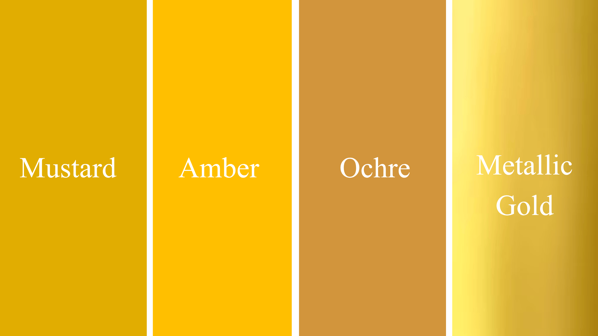
Shades: Mustard, amber, ochre, metallic gold
These tones are ideal for refined table settings, candlelit dinners, and luxurious decor. Golden and amber shades add a touch of sophistication.
They reflect light beautifully, creating a warm glow. Use them in candles, tableware, or accent pieces for an upscale look.
11 Modern Thanksgiving Color Palette Ideas
These updated palettes feel fresh but still capture the spirit of the season. Choose one that matches your style and home.
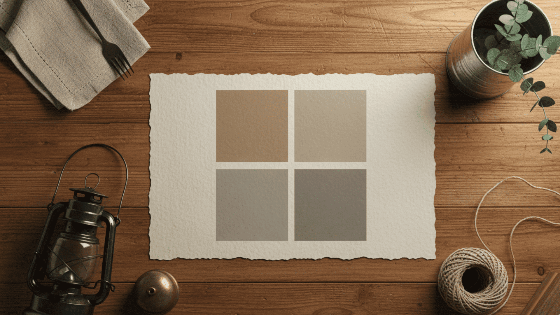
1. Neutral & Minimal Palette
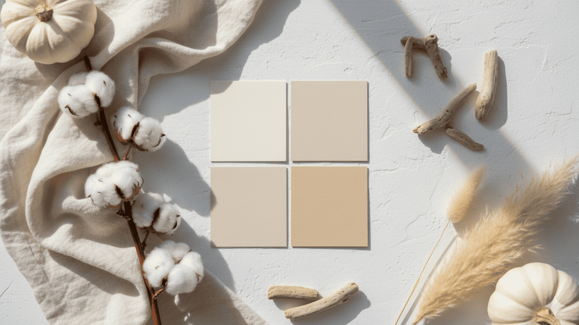
Colors: Cream, ivory, wheat, sand
This palette is refined, airy, and perfect for modern homes. It creates a clean look without feeling cold.
Neutrals let your table settings and textures shine. Use linen napkins, ceramic dishes, and simple greenery to complete the look.
2. Moody Luxe Palette
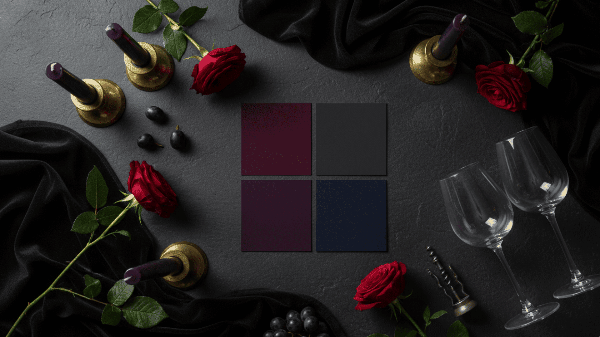
Colors: Plum, burgundy, charcoal, deep navy
This palette is bold and dramatic. It works beautifully for formal dinners and evening gatherings.
Pair these rich tones with candlelight and metallic accents. The result feels luxurious and intimate.
3. Nature-Inspired Greens
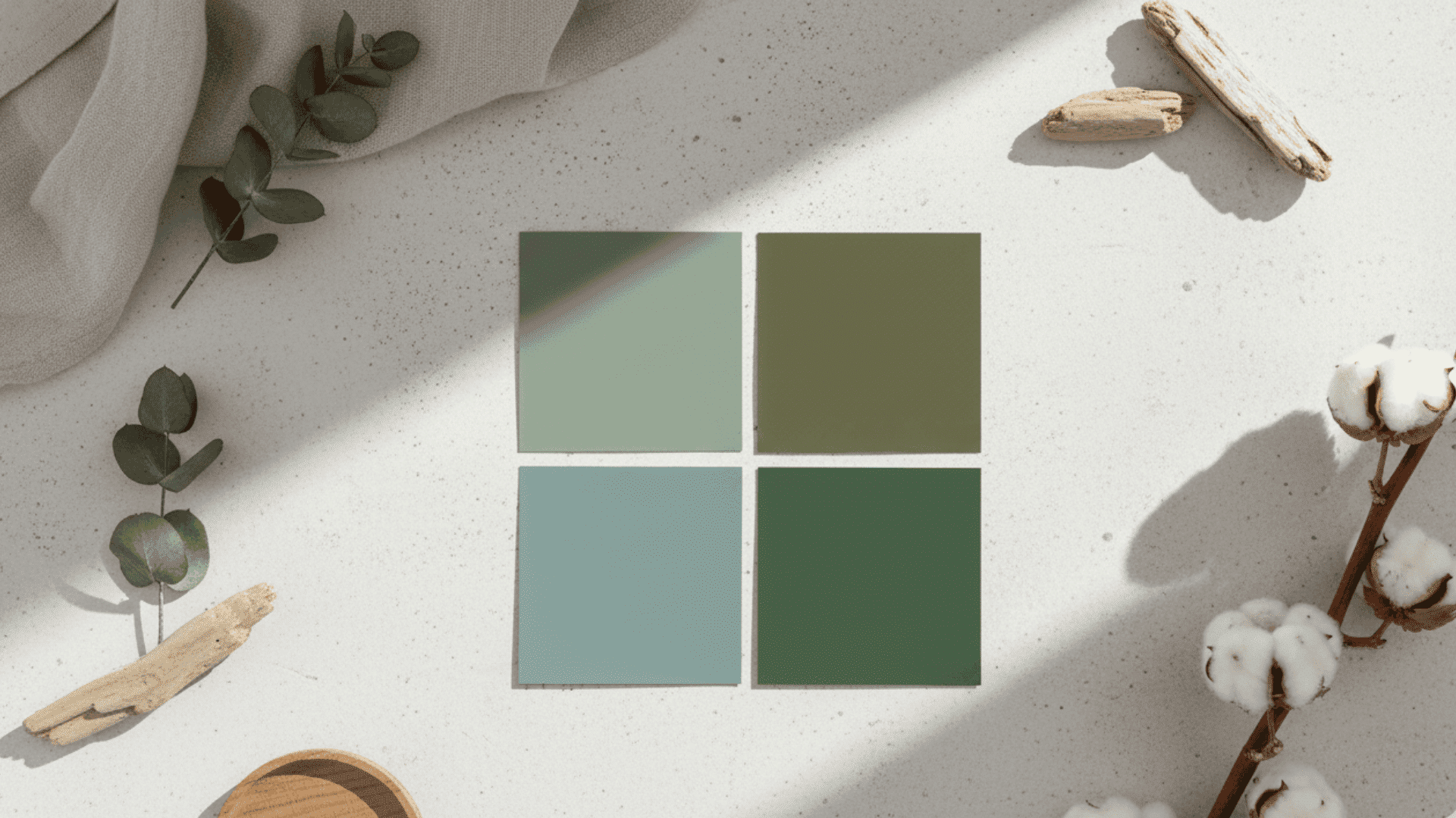
Colors: Sage, olive, moss, eucalyptus green
These shades are calming, organic, and very trendy right now. Green tones bring the outdoors inside.
They pair well with wood elements and neutral linens. This palette feels fresh and grounded at the same time.
4. Soft Pastel Thanksgiving Palette
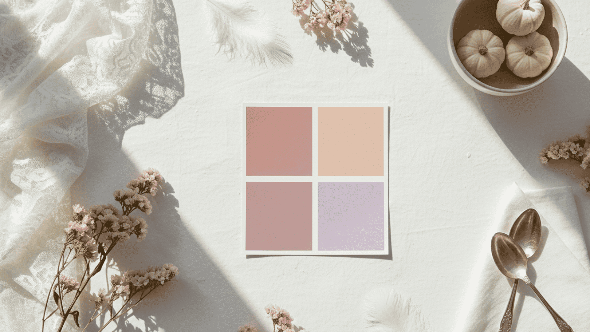
Colors: Dusty rose, peach, mauve, soft lavender
This palette is subtle, romantic, and unexpected for fall. Pastels soften the traditional Thanksgiving look.
They work well in light-filled spaces and brunch settings. Pair them with white or cream for a gentle, feminine touch.
5. Terracotta & Clay
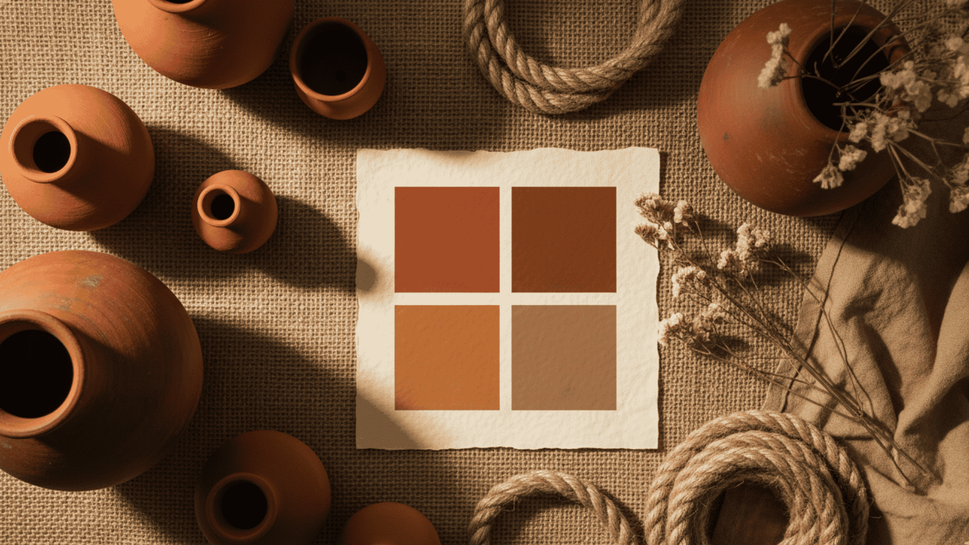
Colors: Terracotta, sienna, burnt umber, warm taupe
This earthy palette has a boho, handmade feel. Terracotta adds warmth without being too bright.
These tones look beautiful with natural textures like jute, linen, and pottery. They create a cozy, lived-in vibe.
6. Copper & Metallics
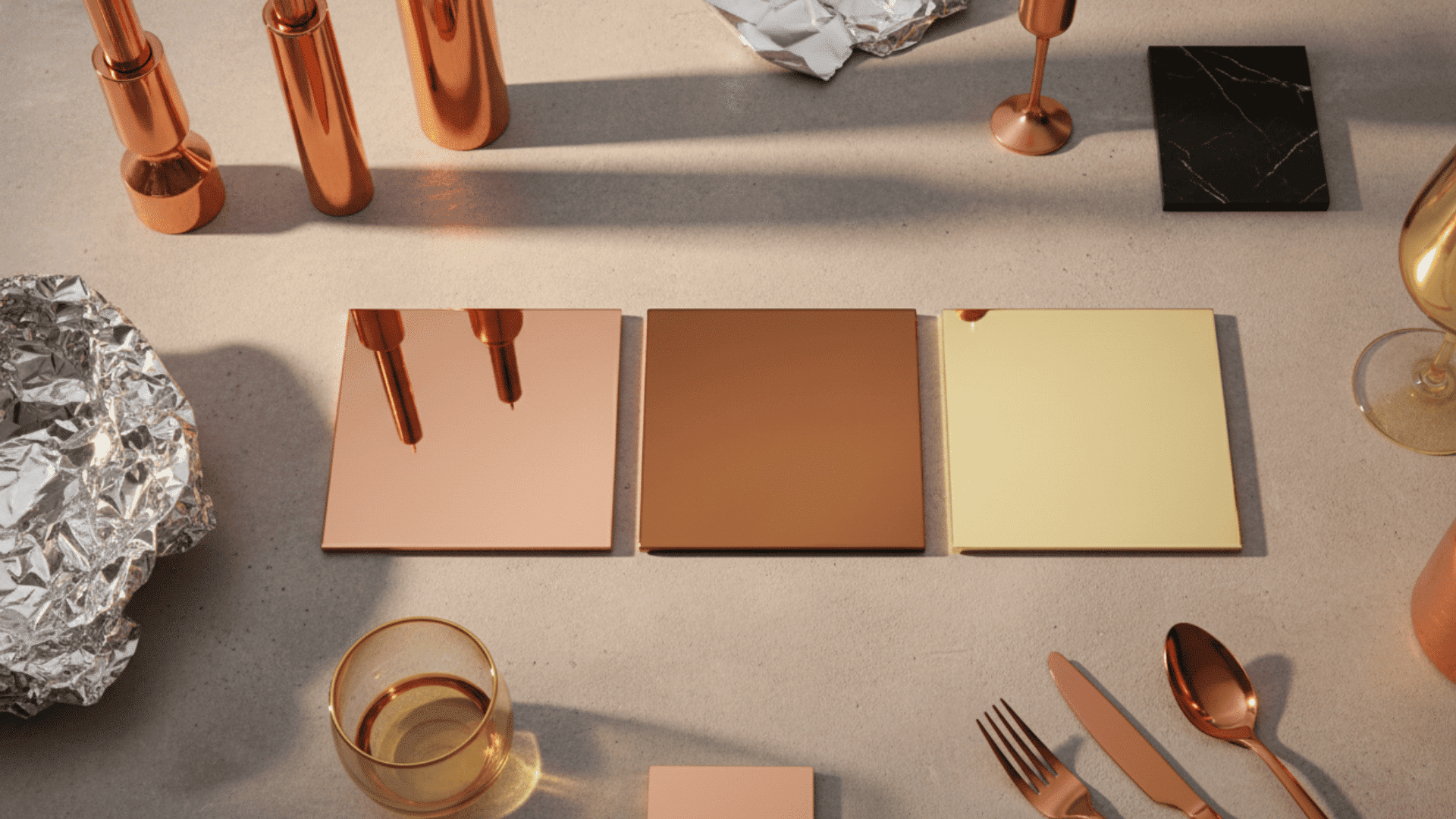
Colors: Copper, bronze, champagne gold
Metallics add a chic twist to traditional Thanksgiving decor. Copper reflects light and brings warmth to the table.
Use metallic flatware, candle holders, or serving trays. This palette feels modern and eye-catching.
7. Navy & Gold
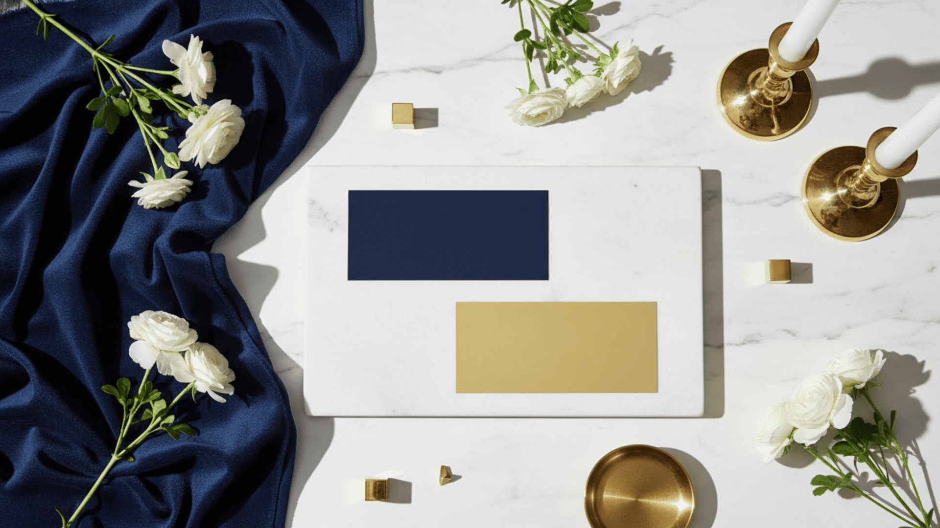
Colors: Deep navy with golden highlights
This combination is formal, crisp, and very modern. Navy grounds the look while gold adds a festive touch.
It works well for evening dinners and upscale gatherings. Pair with white plates and simple florals for balance.
8. Pumpkin Spice Palette
Colors: Pumpkin orange, caramel, cinnamon, toffee
This palette is warm, nostalgic, and full of fall flavor. It feels familiar and comforting. Use it in kitchens, dining rooms, or family spaces. Pumpkin spice tones make everyone feel at home.
9. Harvest Sunset Palette
Colors: Tangerine, coral, muted red
Inspired by a fall evening sky, this palette is vibrant yet soft. It brings energy without being too bold.
Coral and tangerine add a modern twist to traditional reds and oranges. Use this palette for outdoor or daytime gatherings.
10. Farmhouse Neutrals
Colors: Beige, hazelnut, soft grey, black accents
This palette is cozy, versatile, and timeless. Farmhouse neutrals work in any home style.
They pair beautifully with wood furniture and vintage decor. Add black accents, such as candlesticks or frames, for contrast.
11. Kid-Friendly Bright Palette
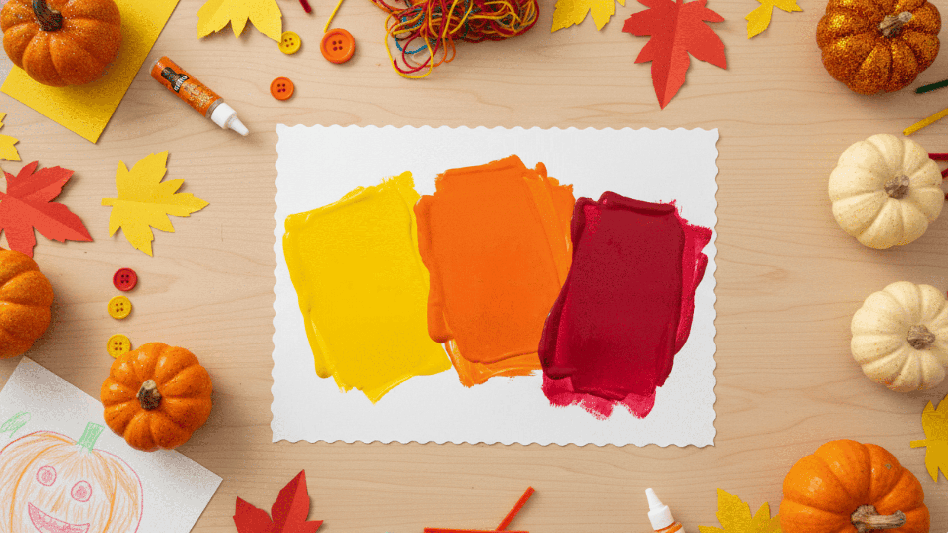
Colors: Golden yellow, bright orange, cranberry red
This palette is cheerful, fun, and perfect for families with kids. Bright colors create a playful, festive mood.
Use them in craft activities, table settings, or outdoor decor. Children love the bold, happy feel of these shades.
Thanksgiving Color Palettes & Their Visual Mood
Use this quick reference guide to match the right palette with your space and style.
| Palette | Key Colors | Works Best In | Overall Mood |
|---|---|---|---|
| Earth Tones | Browns, chestnut | Living room, entryway | Cozy & rustic |
| Golden Amber | Mustard, gold | Table décor | Refined & warm |
| Nature Greens | Sage, olive | Kitchen, dining | Natural & calming |
| Moody Luxe | Plum, charcoal | Formal dining | Rich & dramatic |
| Neutrals | Cream, beige | Modern homes | Soft & minimal |
| Pumpkin Spice | Pumpkin, caramel | Family-friendly spaces | Warm & nostalgic |
| Navy & Gold | Deep navy, gold | Dining room, living room | Formal & modern |
| Terracotta & Clay | Terracotta, sienna | Boho spaces, porches | Earthy & stylish |
| Copper Metallics | Copper, bronze | Table settings, mantles | Chic & shiny |
| Soft Pastels | Dusty rose, peach | Brunch spaces, bedrooms | Gentle & romantic |
| Harvest Sunset | Tangerine, coral | Outdoor areas, kitchens | Vibrant & energetic |
How to Use Thanksgiving Colors in Home Décor
Below are simple, practical ways to incorporate your chosen palette into every room.
1. Table Settings
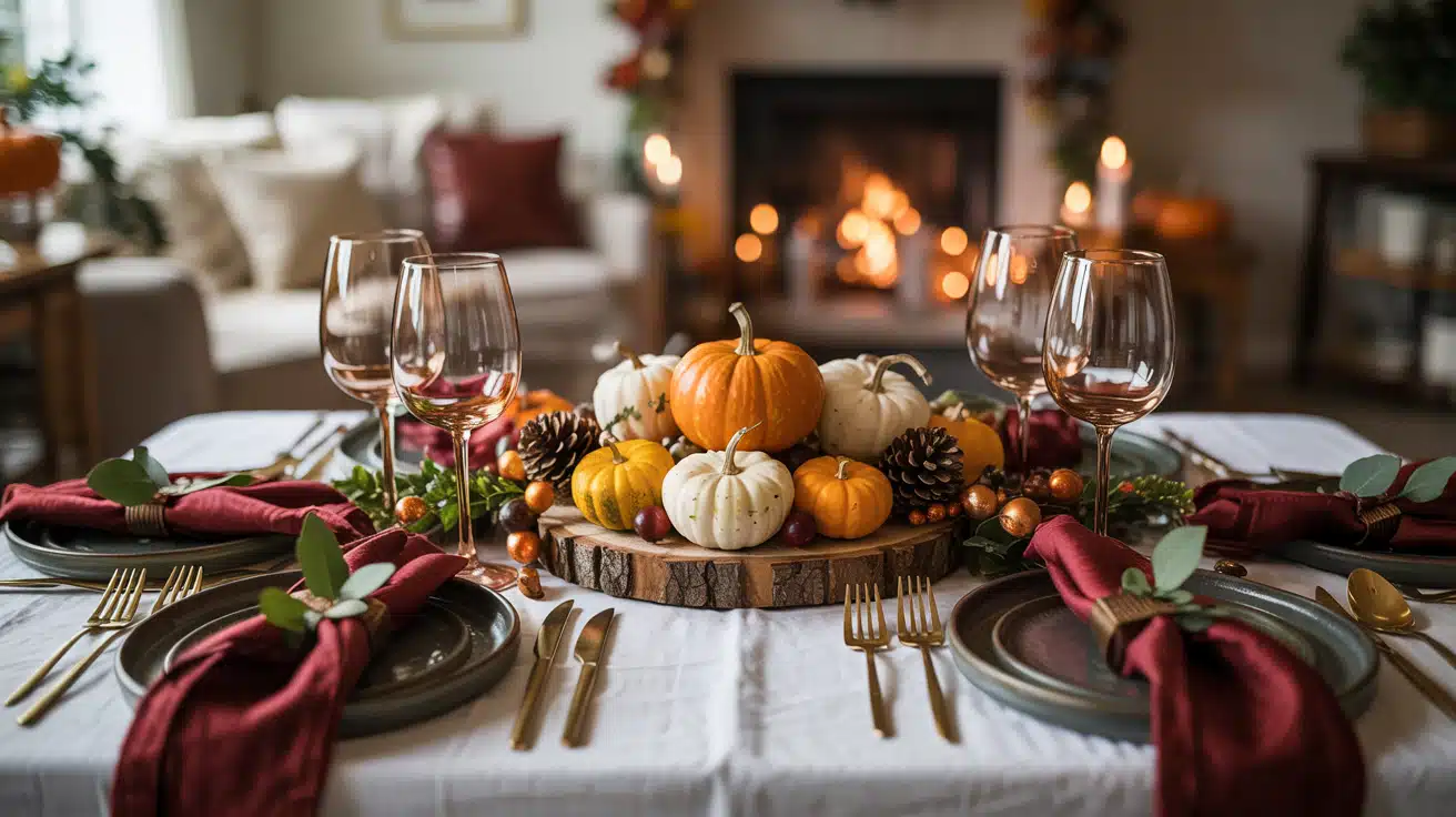
Start with a neutral tablecloth or placemats as your base. Layer warm-colored napkins or a runner in rust, gold, or cranberry on top.
Add a centerpiece filled with gourds, eucalyptus, or fresh berries for natural beauty. Use gold or wooden flatware to bring a stylish, seasonal touch to each place setting.
Mix textures like linen napkins, ceramic plates, and glass stemware to create depth and visual interest.
2. Living Room Decor
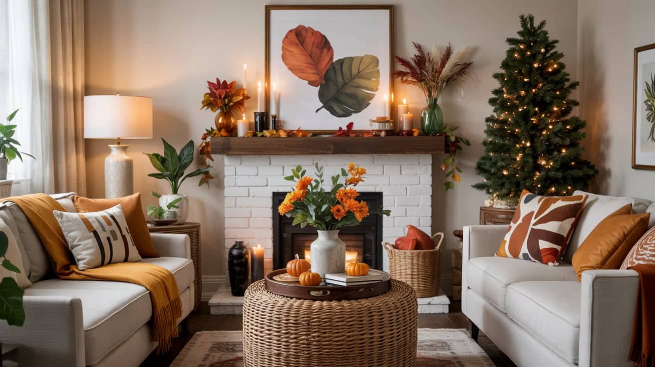
Switch out your everyday throw pillows for ones in warm seasonal colors like burnt orange, mustard, or deep green. Drape a fall-themed blanket over the sofa or armchair for added coziness.
Decorate your mantle with candles in amber or ivory, fresh garlands, and small vases filled with branches or dried flowers.
Introduce wood trays or textured baskets to hold remotes, books, or small decorative items for a rustic feel.
3. Porch & Outdoor Decor
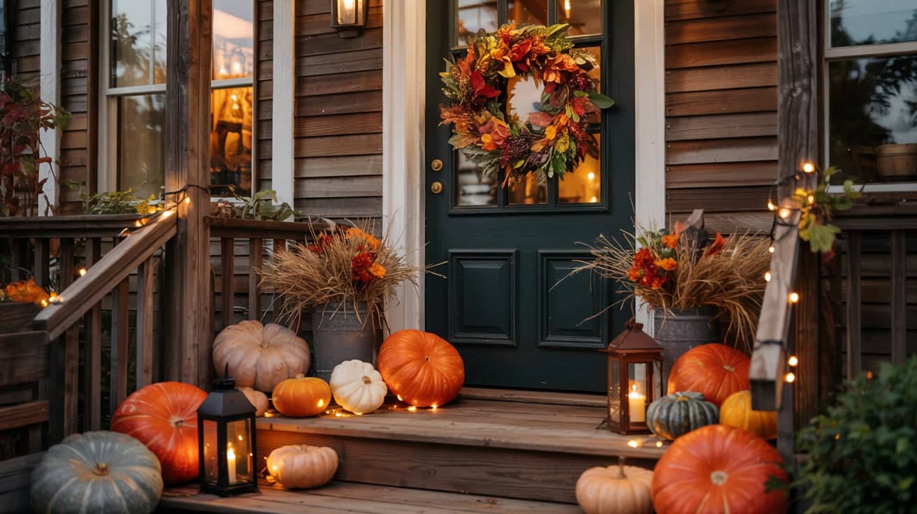
Create a fall wreath for your front door with orange, gold, and deep green accents, such as leaves and berries. Arrange pumpkins in varying shapes, sizes, and colors along your porch steps or entryway.
Add lanterns with candles inside or string lights around railings to create a warm, welcoming glow. Incorporate hay bundles tied with twine or fall florals like mums in planters to complete the seasonal look.
4. Kitchen & Dining Accents
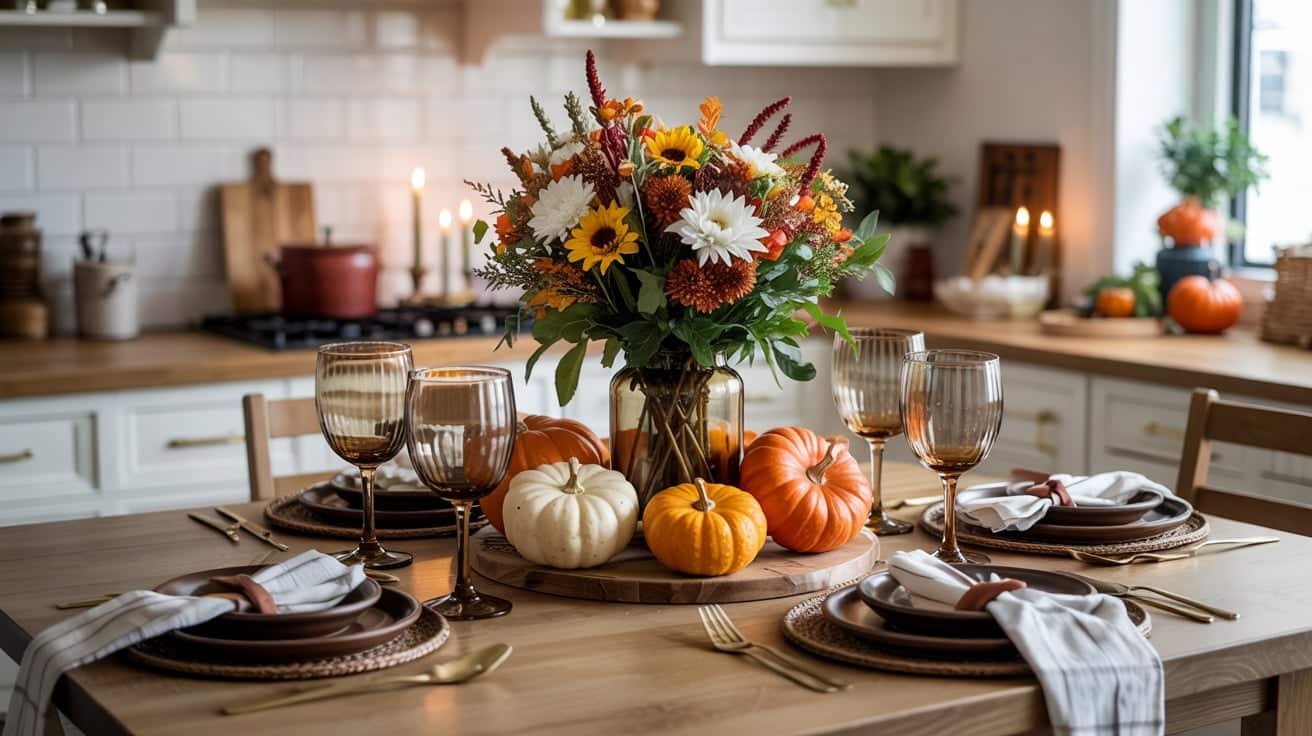
Swap your everyday glassware for amber or smoked glass tumblers and wine glasses. Use rustic plates in earthy tones like cream, terracotta, or deep brown for a seasonal table.
Style a simple fall centerpiece with small pumpkins, greenery, and candles on your kitchen island or dining table. Add seasonal florals like mums, sunflowers, or dried wheat in vases to bring natural color and texture to your kitchen counters.
Tips for Choosing Your Thanksgiving Palette
Follow these simple guidelines to pick the perfect color scheme for your home this Thanksgiving.
- Start with your home’s existing colors so everything flows. Match new decor to your current walls, furniture, and accents for a cohesive look.
- Choose a mood: warm, sleek, modern, rustic, or playful. Decide the feeling you want guests to experience when they walk in.
- Use textures like linen, wood, ceramic, and metal to elevate simple palettes. Layering different materials adds depth without needing more colors.
- Balance bold and soft colors to avoid visual clutter. Pair bright shades like cranberry or pumpkin with neutrals like cream or beige.
- Consider your lighting; warm lights enhance oranges and golds beautifully. Soft, yellow-toned bulbs make fall colors glow and feel more inviting.
Summing It Up
The right Thanksgiving colors can completely change your home and create a warm, welcoming space for the holiday.
Now that you know what Thanksgiving colors are, their history, and how to use both traditional and modern palettes, you can decorate with confidence.
Start by picking a palette that matches your style and existing decor. Layer in textures, balance bold and soft tones, and let your creativity shine. Your guests will feel the care you put into every detail.
Ready to bring your Thanksgiving vision to life? Start shopping for decor, gather your materials, and make this holiday your most beautiful one yet.